PALETTE
40 weeks, 2021
BACHELOR THESIS
Escola Universitaria ERAM
Creation of an app to teach teenagers color semiotics in the audiovisual content through films
Introducing Cinema Palette, an innovative app designed to transform the way we perceive and understand color in film. This educational tool caters to the needs of a generation constantly immersed in audiovisual content, yet often lacks the skills to critically analyze it. Through a series of mini-games, Cinema Palette guides users in exploring the significance of color in storytelling. As users interact with different film scenes, they develop a deeper appreciation of how color shapes narrative, mood, and emotion. This app is more than just a learning platform; it's a step towards empowering viewers to become discerning consumers of media, capable of decoding the subtle messages conveyed through the visual language of cinema.
COLABORATION
IES Celrà | Ferran Altarriba
I coded this app prototype using HTML-CSS-javascript
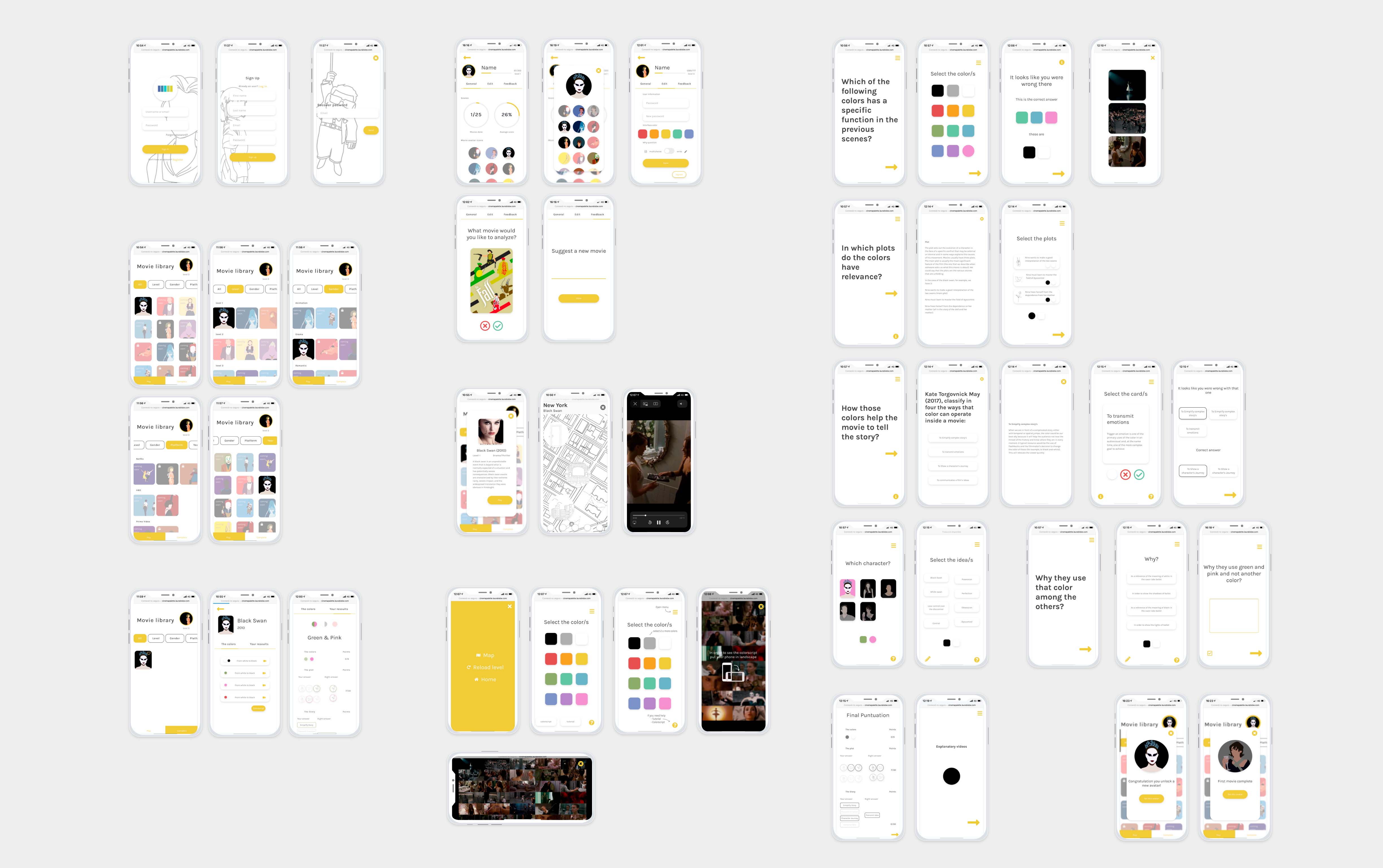
APP
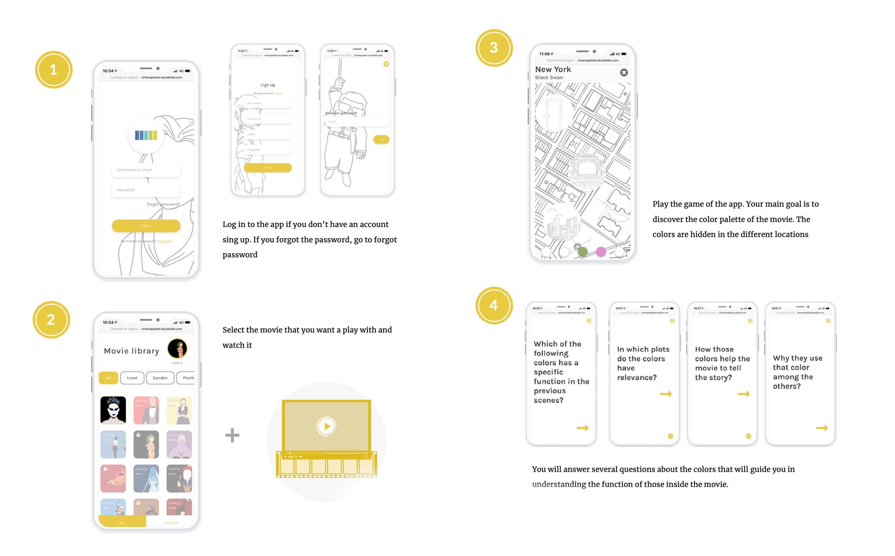
Full app guide
UI
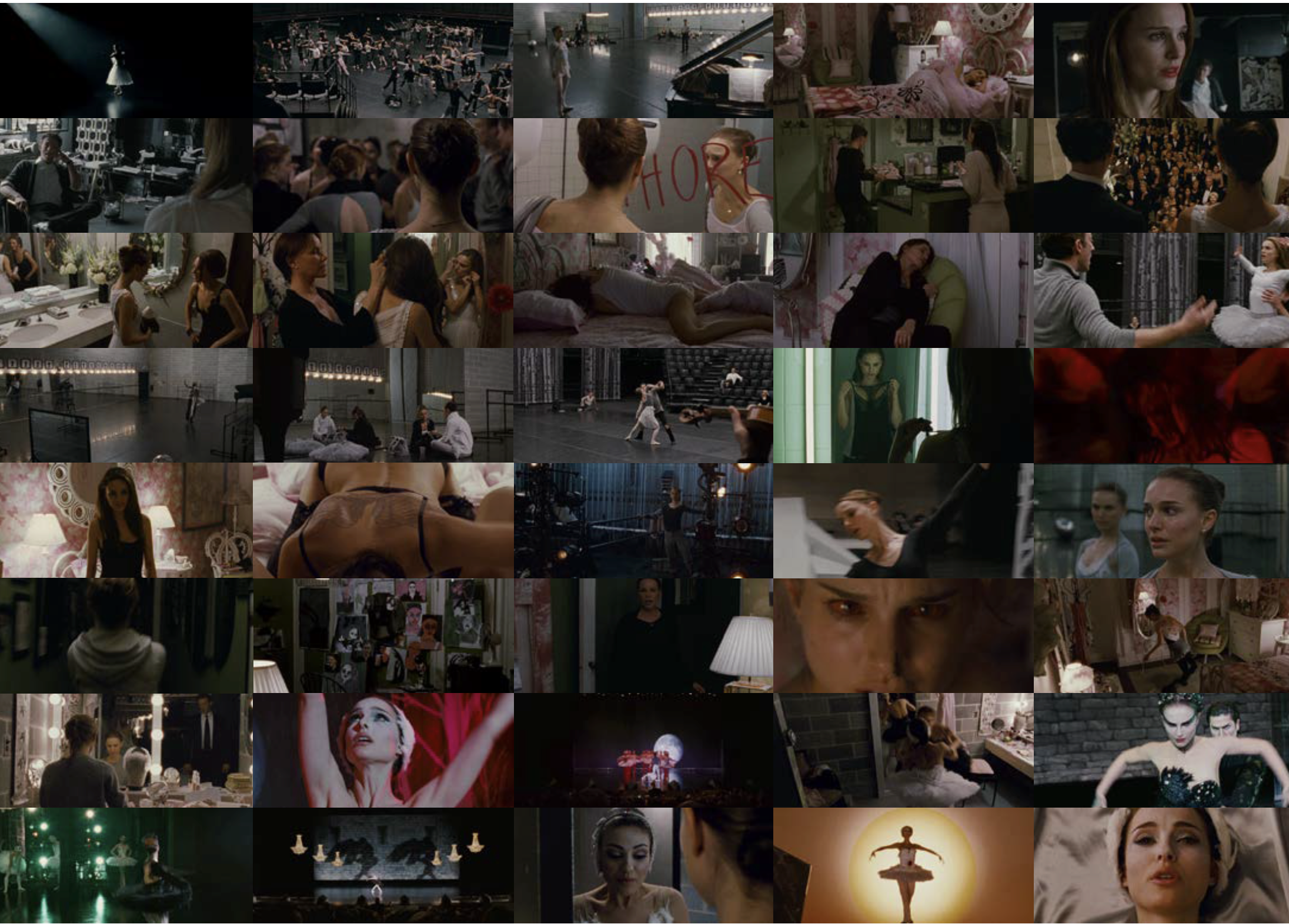
Color analysis video
At the conclusion of each challenge, you'll find a concise yet informative video that I both scripted and edited. These videos dissect the color analysis of the film, providing a clear and captivating exploration of how color is employed to enrich storytelling in cinema. Example from Black Swan.
Research
For this project, I embarked on an exhilarating deep dive into the semiotics of color,
particularly in the realm of audiovisual language. My exploration ventured into the
intricate ways color adds depth and meaning to storytelling in film. I analyzed how colors
are masterfully used to evoke emotions or depict character arcs. My journey included
dissecting various movies to understand these color dynamics, complemented by poring over
directors' notes and concept books. This led me to the fascinating world of Pixar, where the
use of color is so meticulously planned that they create dedicated storyboards, called
colorscripts
Since I completed this project, color has become a pivotal tool in my design. I've been
conducting much more research around this topic, and it has become a key element in my
design work across various areas. This even includes giving a talk about color semiotics at
McKinsey Design.
Full project research
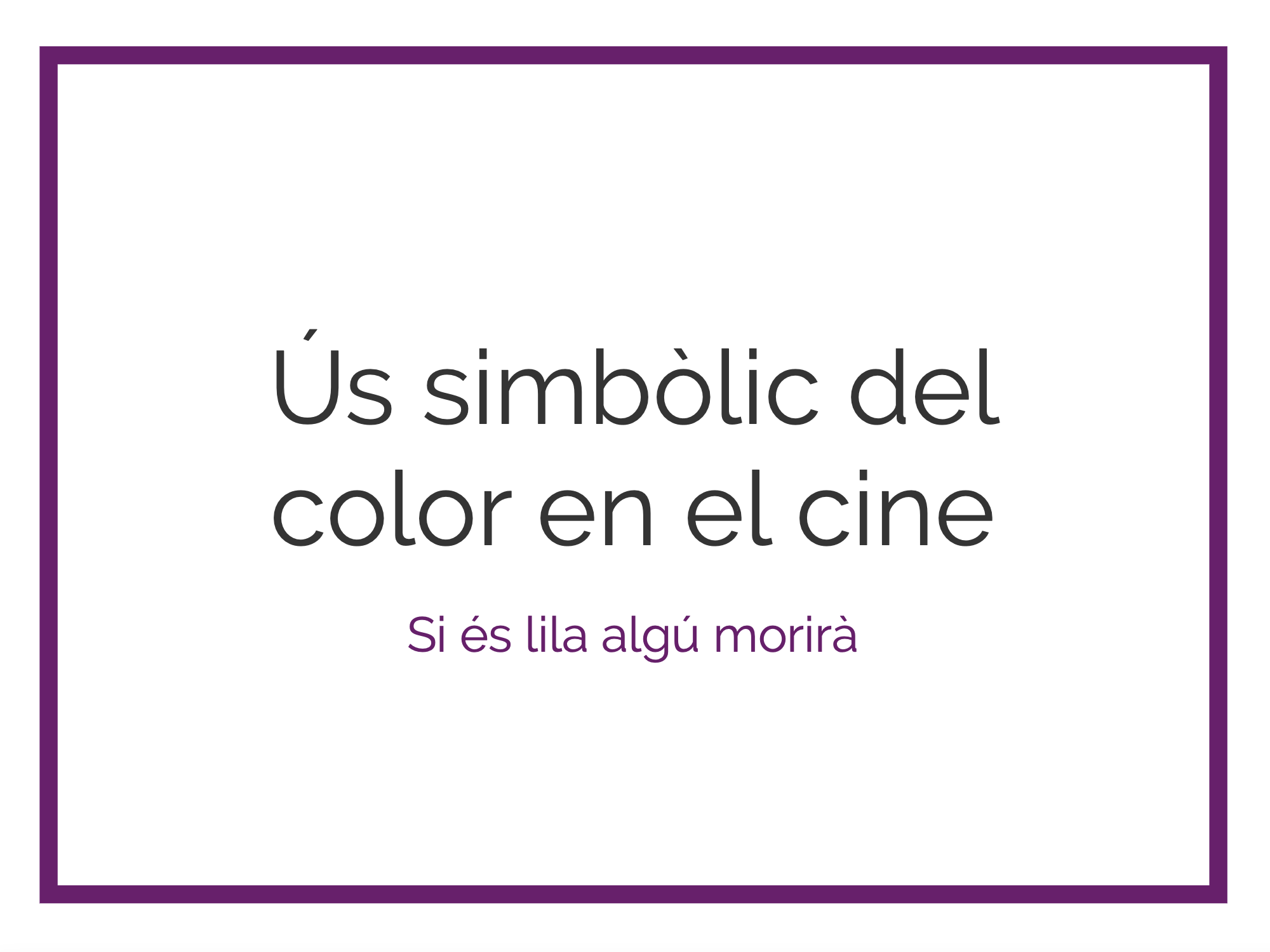
color analisis
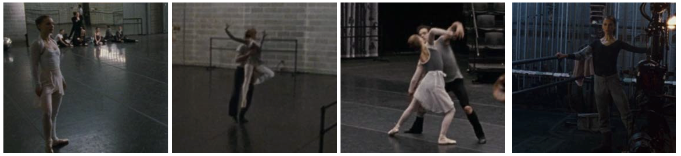
Every time I watched the movie, I was entirely focused on one color, and with the script on hand, I was writing down every time that that color appears, after I was able to see a patron in each one. Following that, I used all the knowledge learned while identifying the topic to identify the connection and a possible explanation of why they chose that color. There are five symbolic colors in the movie: Black, white, green, pink, and red. Following, I would explain the meaning of these colors inside the movie. Also, this explanation is the one performed the voice over in the app explanatory videos
White | Black
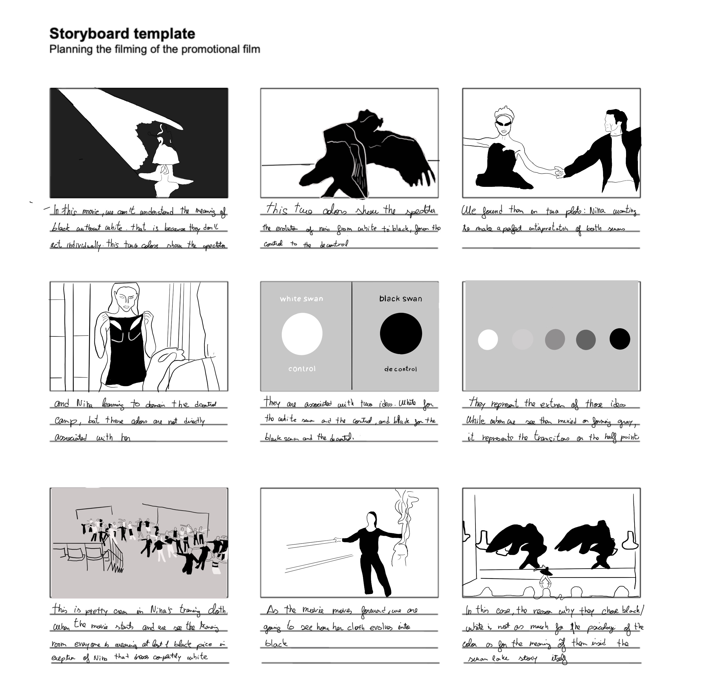
In this movie, we can not understand the meaning of black without white. That is because they do not act individually. This two-color shows the spectator the evolution of Nina from white to black, from the white swan to de black one, from the control to de dyscontrol. We found them in 2 plots: Nina wanting to make a perfect interpretation of both swans, and Nina learning to domain the dyscontrol camp. But these colors are not associated directly with her. They are associated with two ideas. White for the white swan and the control, and black for the black swan and the dyscontrol, indeed these two ideas conditionate each other, more dyscontrol leads to a better performance of the black swan, and for the white is the other way around. Moreover, they represent the extreme of those ideas. We can see this in how Nina and Lily dressed at the beginning of the film. While when we see them mixed or forming gray, it represents the transition or the half points. This is pretty clear in Ninas training cloth. When the movie starts, and we see the training room for the first time, everyone is wearing at least one black cloth, in exemption of Nina that is completely white. As the movie moves forward, we are going to see how her cloth evolves into black. In this case, the reason why they chose black and white is not as much for the psychology of the color as for the meaning of them inside the swan lake story itself.
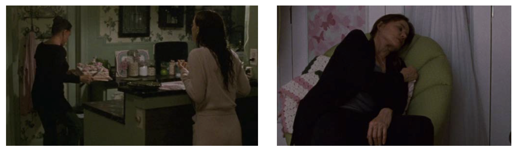
Green
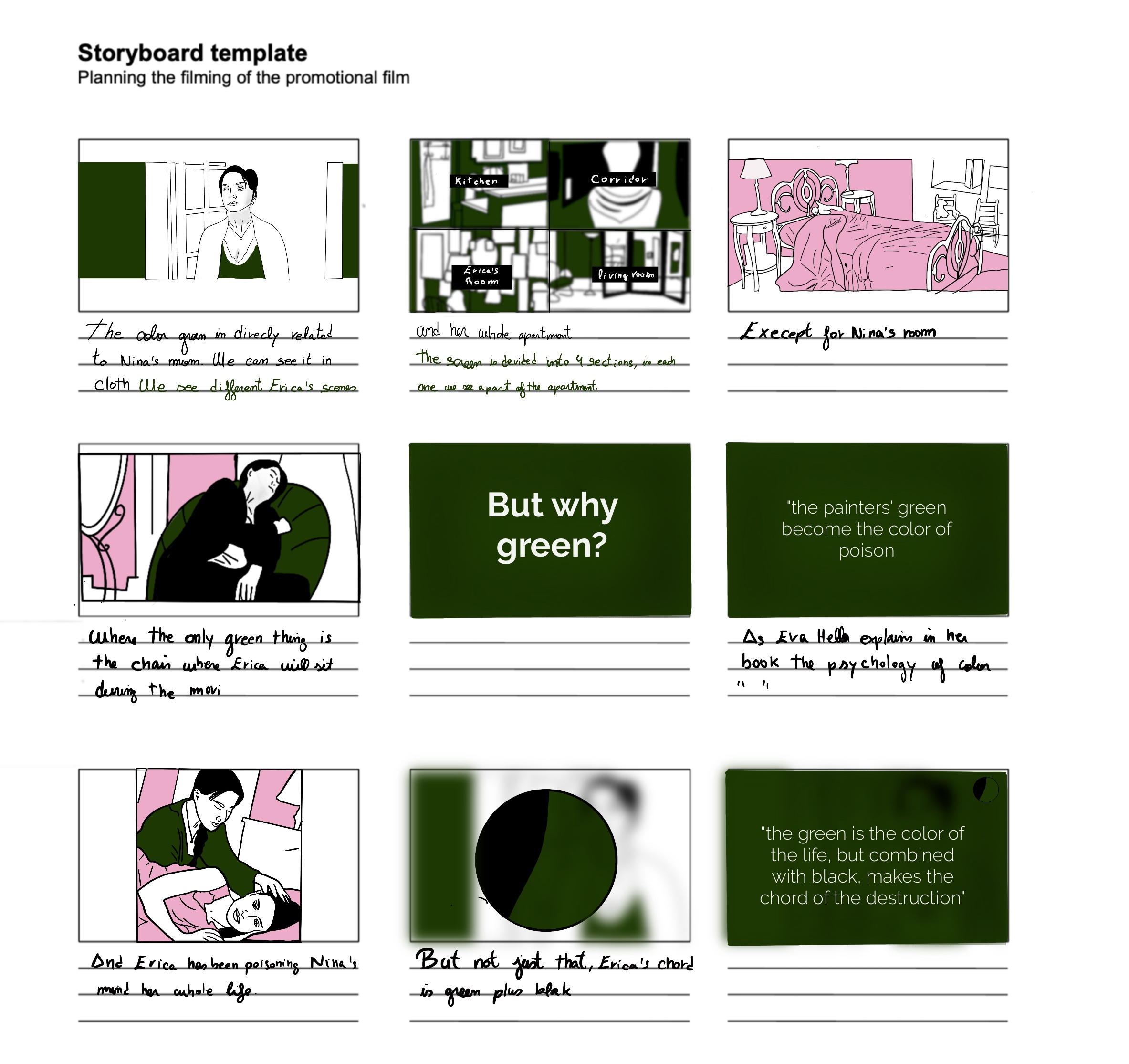
The color green is directly related to Ninas mom. We can see it in her cloth, and her whole apartment is it too, except for Ninas room, where morover the only thing that is green is the cheear where Erica will sit during the movie. But why green? As Eva Heller explains in her book the psychology of color, ""the green of the painters become the color of the poison""(2004, p.3). And Erica has been poisoning Ninas mind her whole life. But not just that, Ericas chord is green plus black ""the green is the color of the live, but combined with black, makes the chord of the destruction" (Heller, 2004 ).
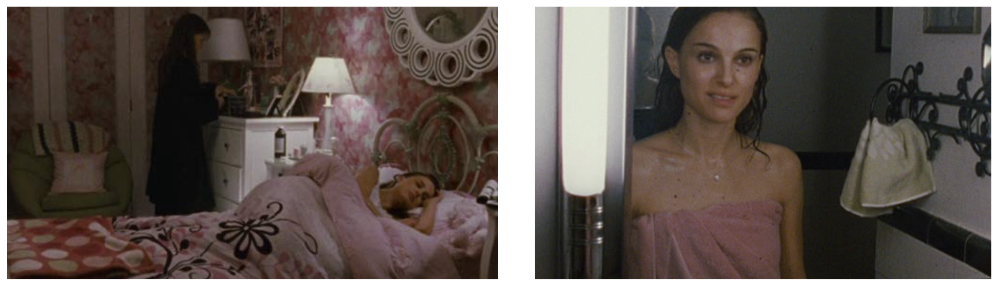
pink
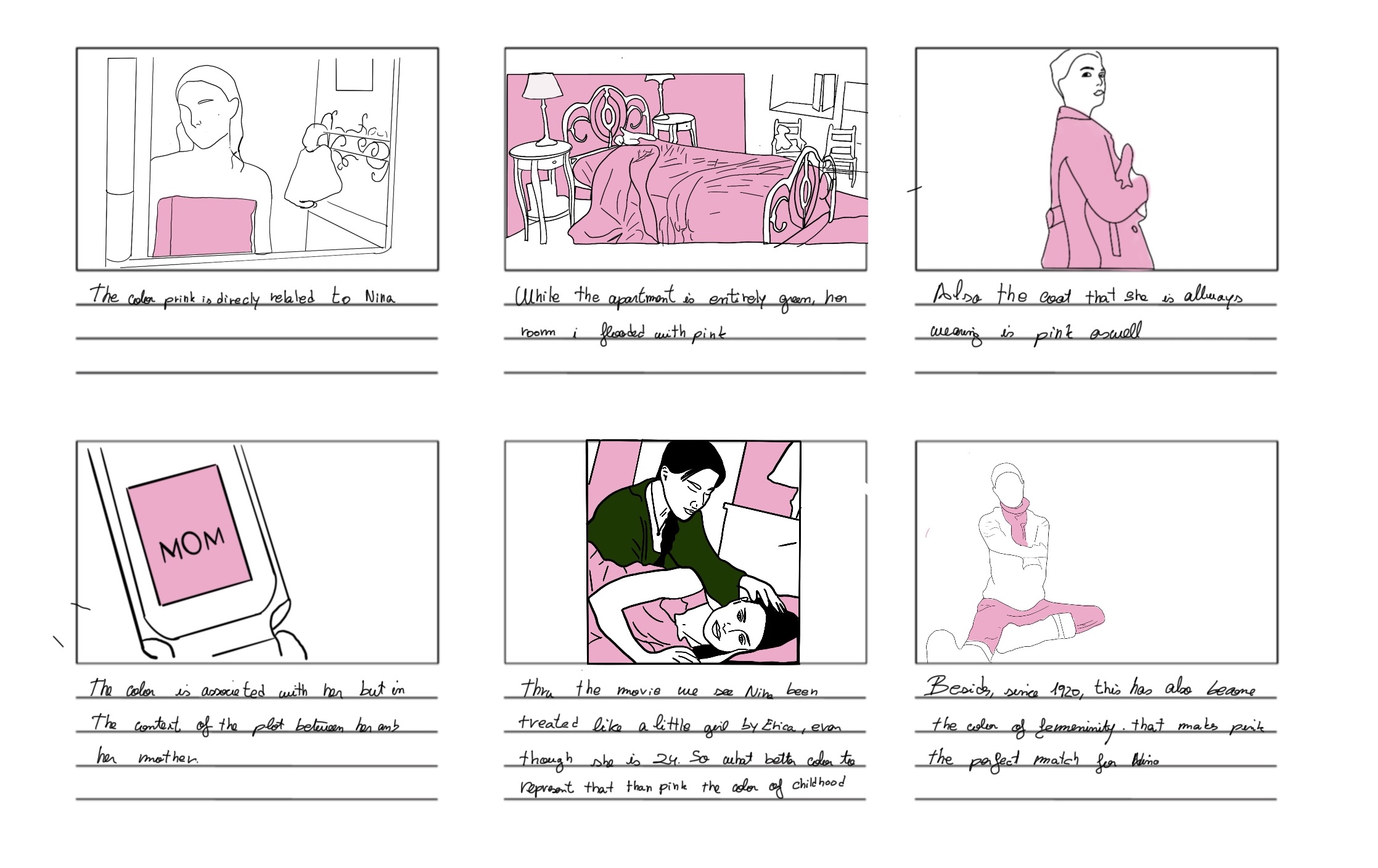
The color pink is directly related to Nina. While the apartment is entirely green, her room is flooded with pink. Also, the coat that she is always wearing is pink as well. This color is associated with her but in the context of the plot between her and her mother. "throught the movie, we see Nina been treated like a little girl by Erica, even though she is 24. So what better color to represent that than pink, the color of childhood. Besides, since around 1920, this has also become the color of femininity. That makes pink the perfect match for Nina. (Heller, 2004)
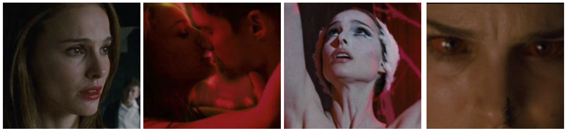
red
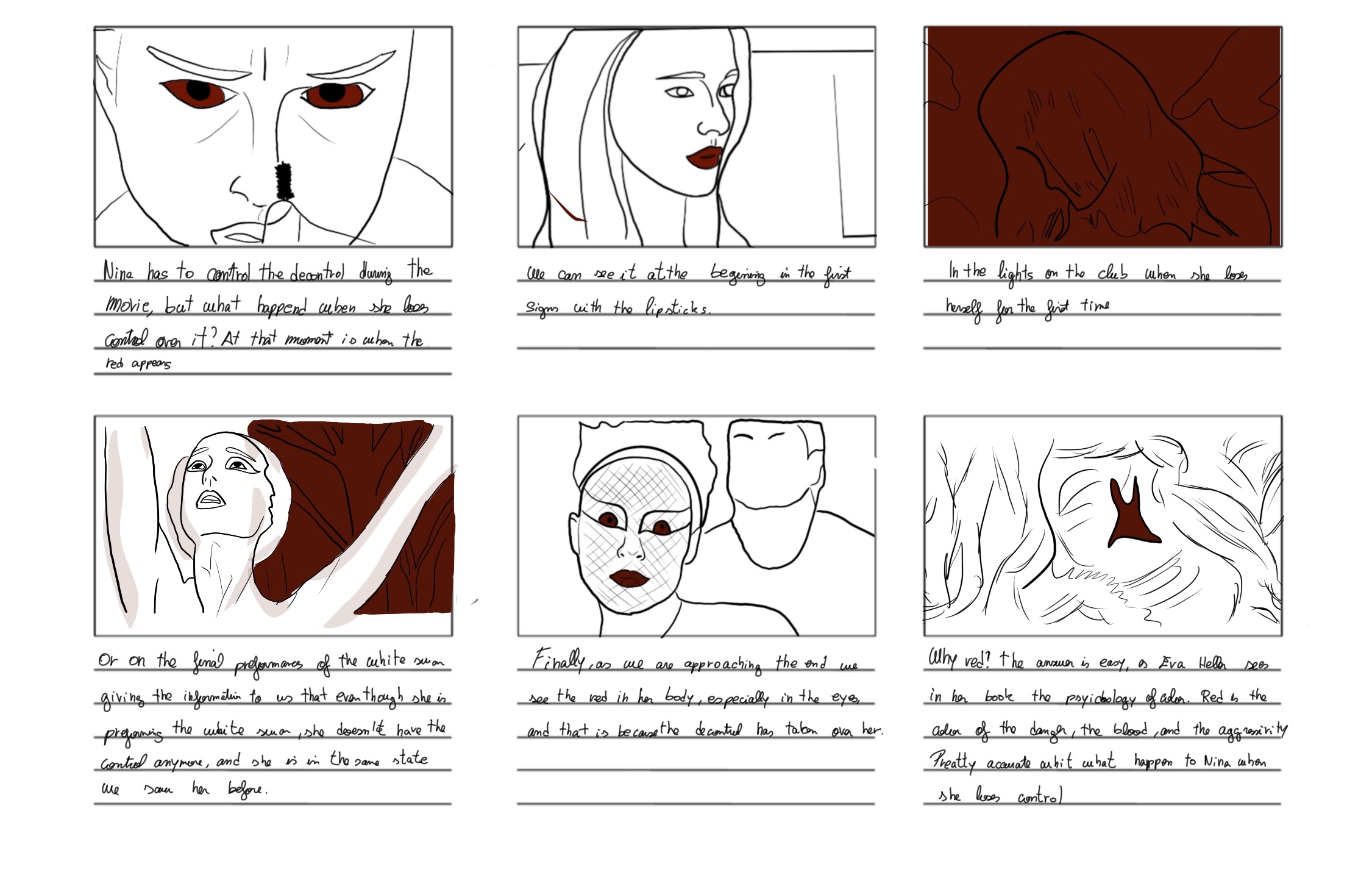
Nina has to learn to control the dyscontrol during the movie, but what happened when she loses con- trol over it? At that moment is when the red appears. We can see it at the beginning in the first signs with the lipsticks. In the lights, on the club when she really loses herself for the first time, or during the final performance of the white swan giving the information to us that even though she is performing the white swan, she does not have the control anymore, and she is still in the same state we saw her before. Finally, as we are approaching the end, we see the red in her body, especially in the eyes, and that is because the dyscontrol has taken over her. Why red? The answer is easy, as Eva heller sees in her book the psychology of color. Red is the color of the danger, the blood, and the aggressivity (heller, 2004) Pretty accurate whit what happen to Nina when she loses control.
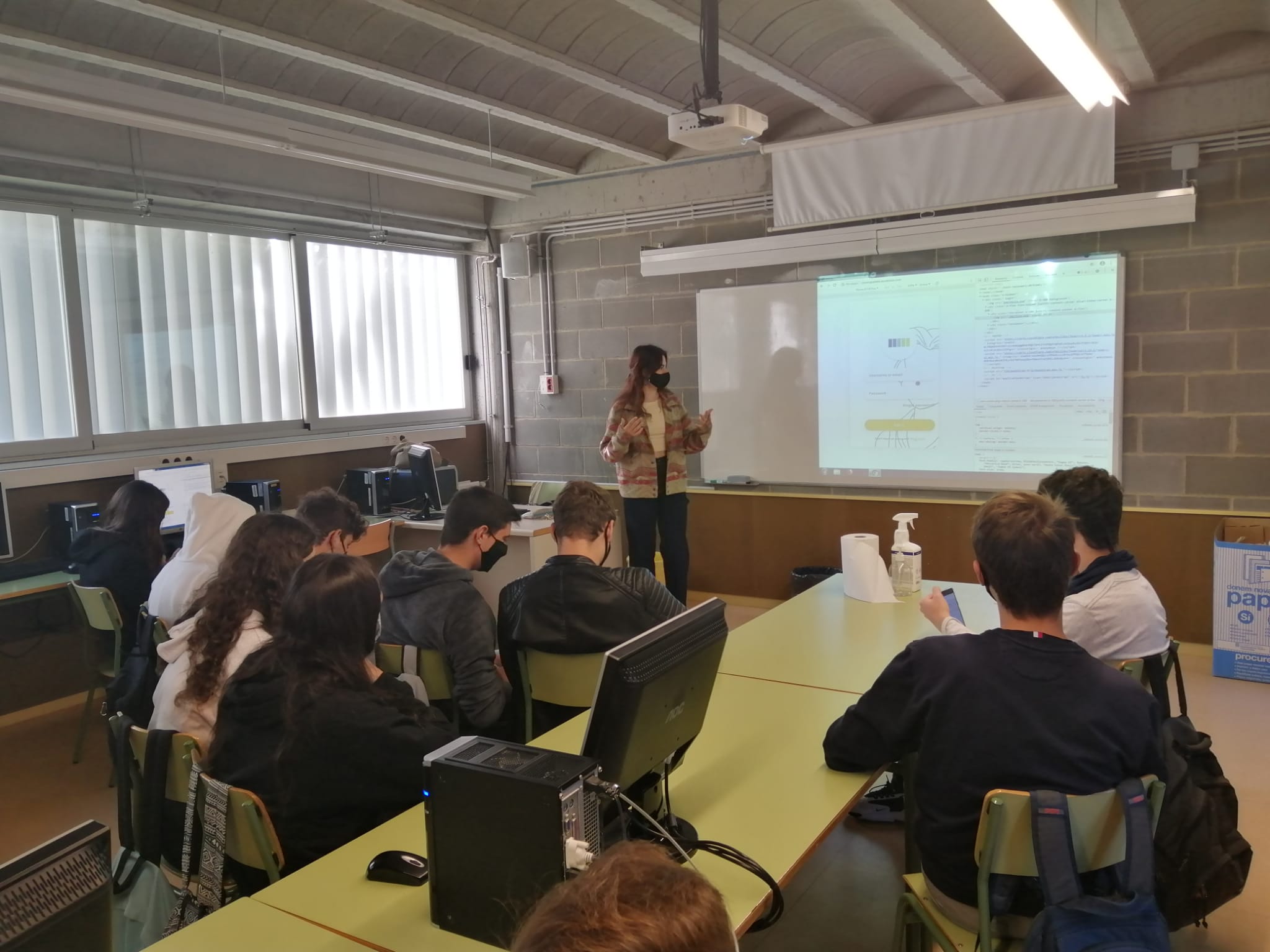
Workshop
At that point in the project, I knew that it was better to search for quality over quantity. Instead of sending surveys to many people, I decided to perform several workshops with smaller groups to get a more close interaction with them. I performed the workshop on a high school with two groups (8 - 13 participants) and had a duration of 2h each, plus an extra (longer) one with 4 studens that had a duration of 5h.
theory
I did a small class summarizing all the information about color that I researched for the project. The main goal is to give them a base about the use of color. This will help them follow the following activities, better understand the projects whole point, and give more active feedback.
black swan
We watched Black swan (2010), and they received the instruction of trying to identify symbolic uses of color around the movie. Nevertheless, without losing the focus on enjoying it, they had to let the unconscious work. Once the movie finished, I ask them about their experience, and we discuss the use
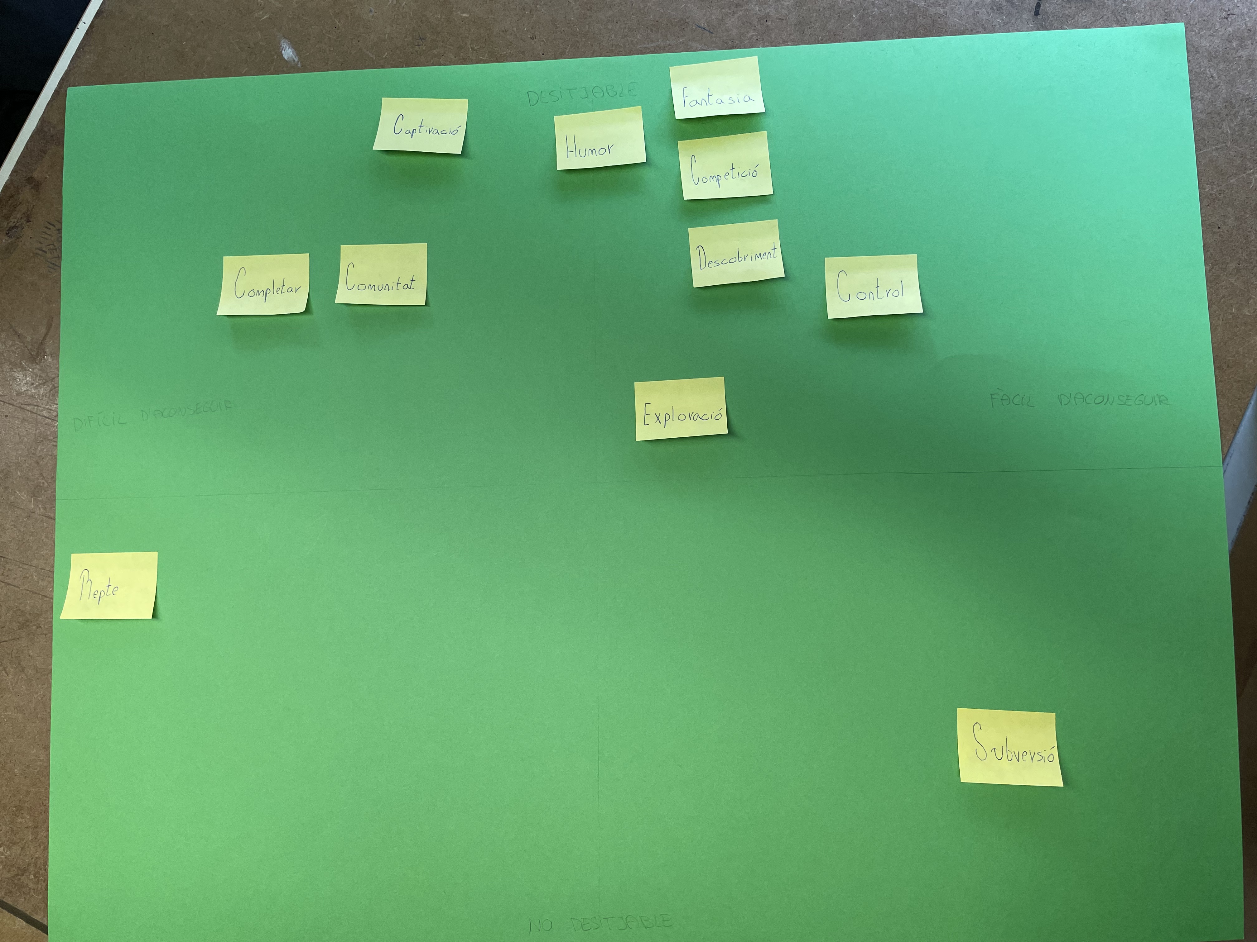
Plex
In order to do this activity in the workshop 2, I divided them into three teams. I picked up the plex cards and wrote them down in postits. Like that, I gave the participants freedom to move the cards around and change their position at any time if they feel like doing it. I gave them an empty graphic in the Y-axis there where the variables (desirable - no desirable) and in the X-axis (complex-Simple) They had to place the play dynamics of the plex card in the graphic, and all the members of the team must agreed on the position. For that, they had to think about what they enjoy in watching a movie and analyzing its color. I asked them to take the experience of that day as a reference.From my part, I acted as a spectator, and I did not intervene in their discussions. However, they could ask me if they did not understand something or needed clarification for some of the cards. Finally, I asked them about their experience while watching the movie that day related to the dynamic they were placing.
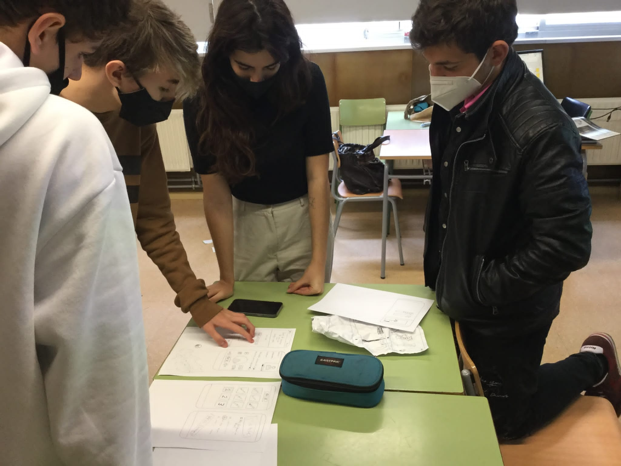
app design
divided them into groups, and I gave them 4ominuts to design the app. I asked them to no think about technical limitations and to focus on either one part of the app or the app in general. There was just one condition: They have had to design an app that they would enjoy playing. Here I wanted to analyzed which kind of game mechanic they used, how they would like to found the information, and ba- sically what would be for them the perfect app. Like that, I will use their designs as a reference for mine.
UX
Storyboard